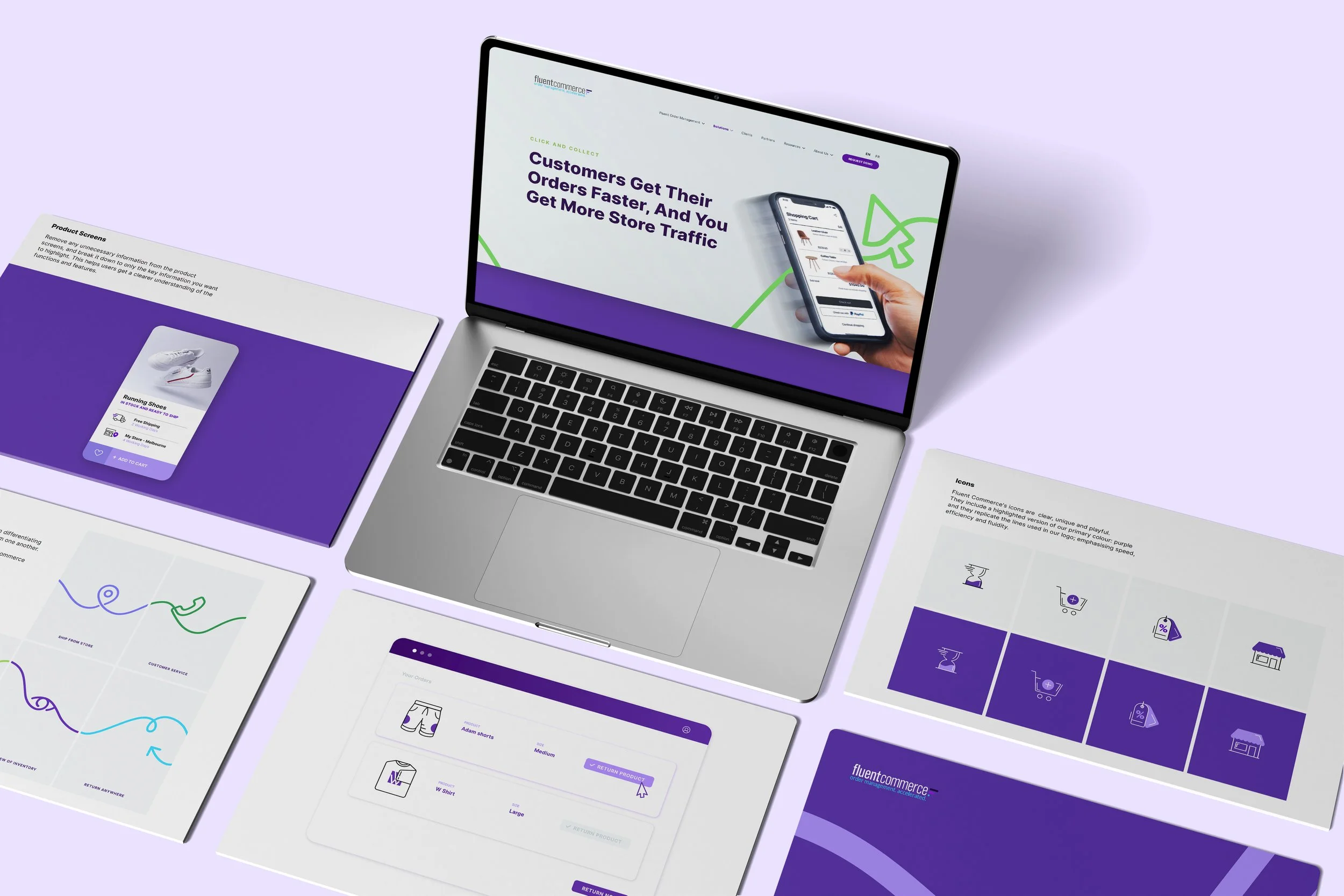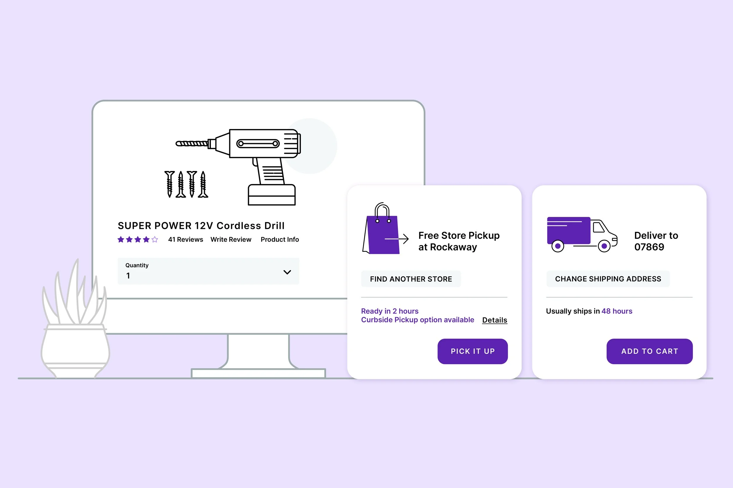
The redesign takes the word “fluent” as its starting point, translating its meaning into a visual identity that feels fluid, connected and effortless. Through flowing lines, confident typography and a distinctive colour palette, the design reflects the seamless movement of commerce and the connections between people, products and technology.
The result is a modern, cohesive brand that feels dynamic, recognisable and built for the future.